Creating a harmonious home environment is vital for fostering comfort and peace, and one of the most effective ways to achieve this is through the use of color schemes. The right color palette can transform a living space, enhancing its aesthetic appeal while influencing the mood and functionality of the area. In this blog post, we explore the fundamental steps for choosing color schemes that promote harmony in the home. We begin with considerations for renters who may face restrictions on paint choices, then delve into strategies for considering existing elements, gathering inspiration, and determining the atmosphere you wish to create. From there, we guide you in selecting and organizing colors into a cohesive scheme, discuss the role of color palette generators, and examine the importance of key and accent colors. By following these steps, you can create a home that is both visually pleasing and personally meaningful.
A note on picking a color palette for a rental
When it comes to choosing a color palette for a rental property, there are unique challenges that homeowners might not face, mainly related to the limitations or restrictions imposed by landlords. Often, renters are unable to paint walls or make significant alterations. However, this doesn’t mean that creating a harmonious living space is impossible. Instead, it provides an opportunity to innovate with temporary solutions and adaptable decor elements. Start by considering versatile elements like furniture, textiles, and wall art. These can be easily swapped out or updated to reflect your desired color scheme without violating rental agreements. Opt for removable wallpaper or decals that can add a pop of color or pattern without permanent changes to the property. Throw pillows, rugs, and curtains are also great ways to inject color into your space, creating a cohesive look that ties different rooms together, even if walls must remain neutral. Finally, think about color coordination with items you can easily modify, such as lampshades, bed linens, and decorative accessories. By creatively working within set parameters, renters can still achieve a harmonious home that feels uniquely their own without risking their security deposit.
1. Take into account the existing elements
Before you dive into selecting colors, assess the existing elements in your home that you either cannot change or don’t plan to change. These could include flooring, cabinetry, countertops, and fixed architectural features. The color and material of these elements will play a crucial role in determining a suitable color scheme that complements rather than clashes with the existing setup. Focus on identifying the underlying tones present in these fixed elements. Do your floors have a warm, wooden tone, or a cool, gray hue? Are your cabinets a bright white or feature a natural wood finish? Understanding these color cues will guide your palette choices, ensuring that new colors enhance rather than compete with what’s already in place. Once you have a clear grasp of the existing elements, consider how these might influence or limit your color choices. For instance, a living room with a fireplace made of rustic red bricks might suit a palette that incorporates warm, earthy tones. This step is essential in creating a balanced and intentional look that respects the given architecture and finishes.
2. Go on a pinning spree
In the process of selecting a harmonious color scheme, gathering inspiration is an exciting and integral step. Platforms like Pinterest and Instagram are treasure troves of design ideas that allow you to explore a vast array of color palettes and interior styles. Going on a pinning spree will help you assess various combinations and find what resonates with your personal taste and vision for your home. As you pin, pay attention not only to the colors but also to the context in which they are used. Notice how colors interact with furniture, lighting, and architectural elements in the images that appeal to you. This can provide valuable insights into how different hues might work in your own space and help narrow down options to those that feel cohesive. Another benefit of a pinning spree is that it organizes your preferences visually. Over time, you might notice commonalities in the colors or styles you are gravitating towards. Use this information as a guide to zero in on potential color schemes for your home. Inspiration boards not only fuel creativity but also act as checkpoints, ensuring your design choices align with your aspirational vision.
3. Think about how you want the room to feel like
The emotional and psychological impact of colors is a significant consideration when crafting a harmonious home environment. Different colors evoke different feelings, and understanding this can help you select schemes that match the desired mood of each room. Before settling on a color scheme, envision the atmosphere you want to create in each space. Consider, for instance, that blues and greens are often associated with calmness and serenity, making them ideal for bedrooms and bathrooms. On the other hand, vibrant colors like reds and oranges are energizing and can add a lively dynamic to social spaces like living rooms or kitchens. Soft, neutral tones are versatile and can invoke a sense of warmth and spaciousness, suitable for open-concept areas or places where you seek a more understated elegance. Additionally, think about your lifestyle and how each room functions throughout the day. A home office may benefit from stimulating hues such as yellows, which can enhance focus and creativity, whereas a dining area might be better suited for colors that promote relaxation and conversation. Aligning your color choices with the emotional tone you wish to set enhances the functionality and comfort of each space.
4. Pick 3 to 5 colors
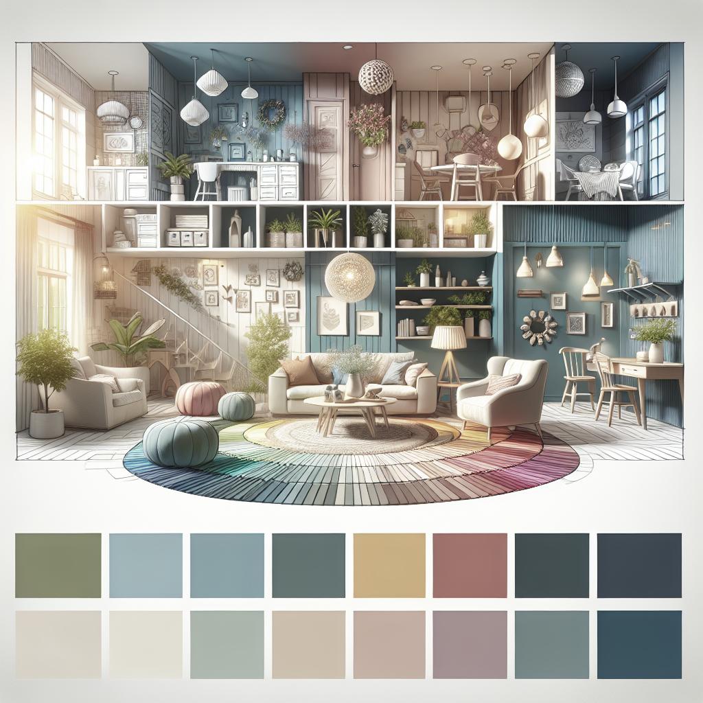
A harmonious color scheme typically starts with the selection of three to five colors. This number provides enough variety to create interest while maintaining cohesion. More than five colors can often result in a cluttered or overwhelming appearance, whereas fewer than three may limit your ability to create depth and dimension. The key here is to choose colors that work together harmoniously. One popular approach is the 60-30-10 rule, which suggests using three colors in varying proportions: 60% of a dominant color, 30% of a secondary color, and 10% of an accent color. This formula can be adjusted if you opt for additional hues. However, the principle remains effective in organizing a balanced and visually appealing palette.
Color palette generators for interior design:
For those who find it challenging to select colors, digital tools like color palette generators can be invaluable. These tools analyze your chosen base color or an inspirational image and suggest complementary shades, easing the selection process. Options like Adobe Color, Coolors, and Canva can be accessed online and provide instant visuals of potential color combinations. Such tools empower even novice decorators to design professionally coordinated color palettes with ease.
5. Choose 2 colors as your key colors
With your palette in place, it’s time to identify two colors to serve as the key colors in your scheme. These will be the most prominent throughout your home and should reflect the dominant and secondary hues from your chosen color palette. Selecting two key colors allows you to maintain consistency across different rooms, reinforcing a continuous and harmonious aesthetic. In practice, these key colors can appear in significant elements such as walls, large furniture pieces, or carpeting. They set the foundation of your interior design and establish a sense of uniformity while allowing subtle shifts in the accompanying accent colors to customize the mood of each space. When choosing these key colors, consider their interactions in both daylight and artificial lighting. Observe how they look at different times to ensure they consistently perform to your expectations—enhancing your overall living experience.
6. Complementary colors (accent)
Accent colors are the final piece of the puzzle, injecting character and personality into your interior color scheme. While key colors form the backdrop, accent colors provide contrast and highlight specific features, giving your design depth and vitality. When choosing complementary accent colors, consider shades that not only complement the key colors but also offer a visual pop. Experiment with textiles, wall art, or decorative objects that incorporate these tones to bring focus to smaller areas and details without overpowering the primary color elements. Utilize accents strategically to draw attention to architectural features or create visual interest in less prominent spaces. For example, a bright, complementary color may bring a pop of vibrancy in the form of throw pillows or a piece of artwork, while a softer accent might be better suited for areas intended for rest, like a reading nook or a bedroom corner. This artistic balance leverages contrast without disrupting the overall harmony of your home.
Final thoughts
To summarize this color journey, here’s a table that encapsulates these steps for creating a cohesive and harmonious home color scheme: “`html
| Step | Description |
|---|---|
| Picking a color palette for a rental | Innovative solutions for renters to create a color scheme without violating restrictions. |
| Take into account existing elements | Assess existing features that are unchangeable to align your color scheme. |
| Go on a pinning spree | Gather visual inspiration to identify your preferred color styles. |
| Think about how you want the room to feel like | Determine the mood and emotion you want each room to convey through color. |
| Pick 3 to 5 colors | Select a balanced palette with up to five colors for flexibility and cohesion. |
| Choose 2 key colors | Choose dominant and secondary colors to maintain consistency throughout your home. |
| Complementary colors (accent) | Use accent colors to add contrast, depth, and interest without overwhelming the space. |
“` By following these steps, you can transform your home into a well-balanced and aesthetically pleasing sanctuary that truly reflects your personality and lifestyle preferences.